Andy Fenstermaker
"This dude's a damn nerd."
*Random YouTube Commenter
EARLY LIFE & EDUCATION
Born at the cusp of the northern midwest winter chill in the dawn of a new decade, Andy was whisked away to be raised amidst the wolves in the outskirts of Portland, Oregon. Across the river in Washington, it was rolling forested hills and deep farmland at the time. A relatively solitary childhood, he formed an insatiable desire to lean into his passions and find a connectedness within.
Music has always been a part of his life, inspired initially from his paternal grandfather, who had played in a variety of bands dating back to the 1940s. Andy followed his footsteps, becoming a saxophonist during his formative years. However, he was geared more toward the appreciation of music, which is where he honed his craft for the written word and found true love.
Andy graduated from Washington State University with a BA in Communication (2004) and an MBA with a focus in Marketing (2006).
CULTIVATING PASSION
Andy has been obsessed with discovering music and sharing his discoveries with others for as long as he can remember. Always the advocate (a true INFJ and Enneagram 9), he is wired to give more than he takes. This is a core value, and something he leans into daily.
Likewise, he strives for continual inner growth, always striving to improve himself and his talents. From leaning into deep self-work to knowledge surrounding his various passions, Andy is always developing new skills to master his many crafts.
CAREER
With over 16 years of strategy, digital marketing, and content creation, Andy possesses a uniquely uncanny left-brain meets right-brain understanding of how both creative and data work together.
He cut his teeth at agencies early in his career, working with international brands as well as local and regional companies ranging from fashion and automotive to banking and health care. He then flipped to the client side, spending time in a variety of diverse industries including e-commerce, PowerSports, small government, and real estate.
Andy embodies a growth mindset. He thrives in his passions and enjoys leaning into them both at work and in play.
In 2003, Andy entered the professional world with a brief stint in PR at Strategies 360 before returning to WSU to get his master’s degree. After graduating with his MBA, he worked at Seattle’s 206, Inc. on client projects for Toyota and Urban Outfitters before joining branding and marketing agency BrandQuery in Mount Vernon, Washington.
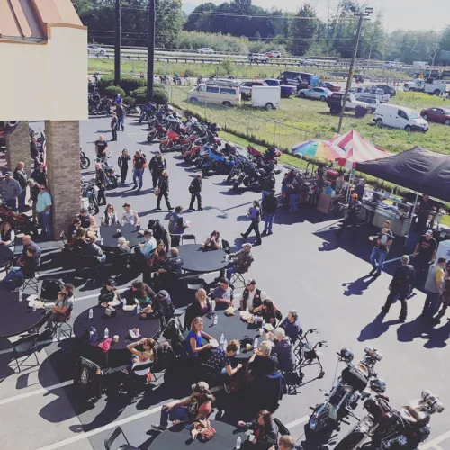
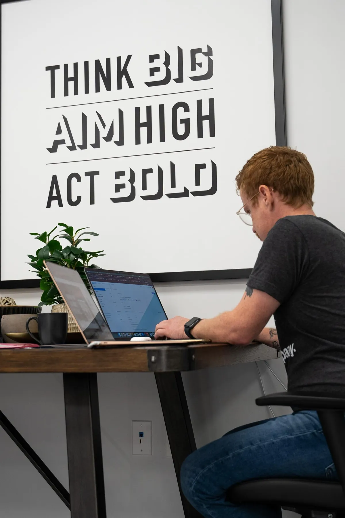
From there, Andy moved to the client side, leading the marketing department at Lights For All Occasions before hopping over to the management team at a Harley-Davidson dealership. After a break from Marketing and a move to Texas at the cusp of the pandemic, during which he worked for Collin County, Andy landed a gig with Linda McKissack and Keller Williams. As Marketing Director, he works on a variety of projects parallel to real estate, online education, and wealth building.
Andy is adept at digital strategy, campaign development, and out-of-the-box thinking. With an equally paired left and right brain, Andy has a keen eye for both good design and data analysis. You are just as apt to find him creating eye-catching graphics in Canva as you are strategizing list growth strategies.
SIDE HUSTLES & PASSION PROJECTS
Andy dips his toes into a variety of side hustles. After joining the independent college radio station KZUU in Pullman in 2005, he discovered how much he enjoys sharing the music he loves with a wide audience. Upon graduating, he launched FensePost as a music blog to continue sharing his discoveries.
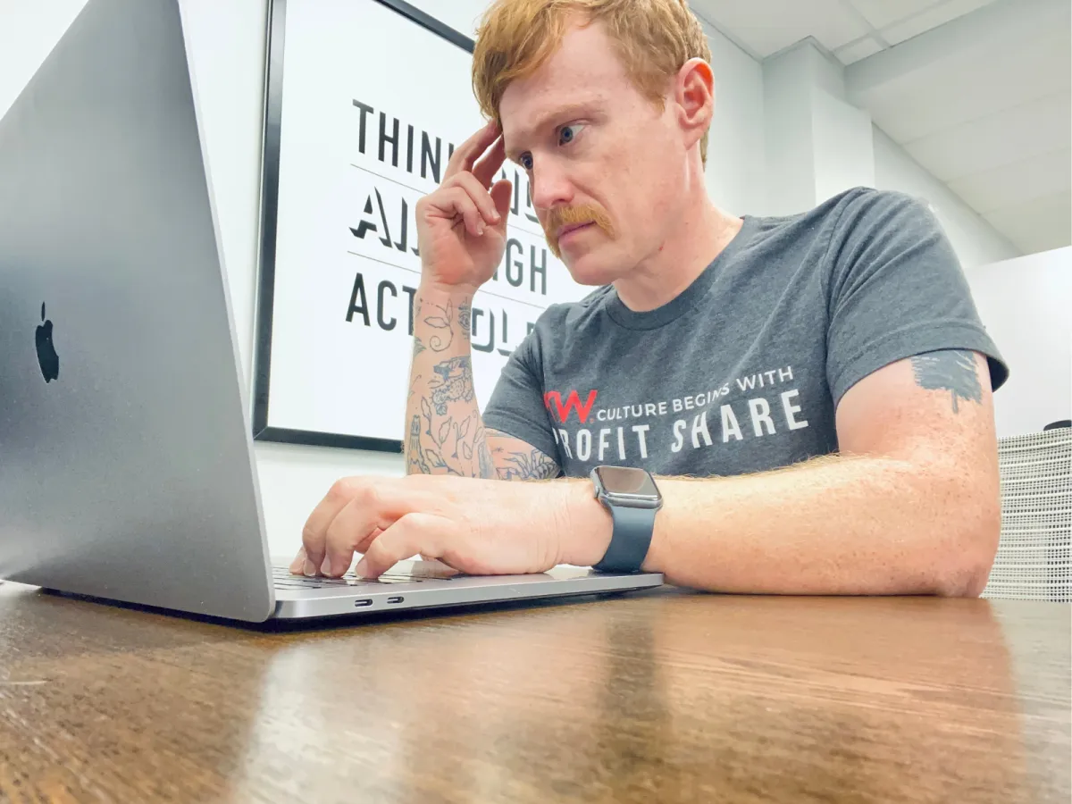
Fast forward to today and Andy owns FensePost Media, LLC which includes a variety of projects, from recruiting for Keller Williams and coaching other agents on how to best leverage Profit Share Sites, to continuing his love of championing his favorite musicians and bands.
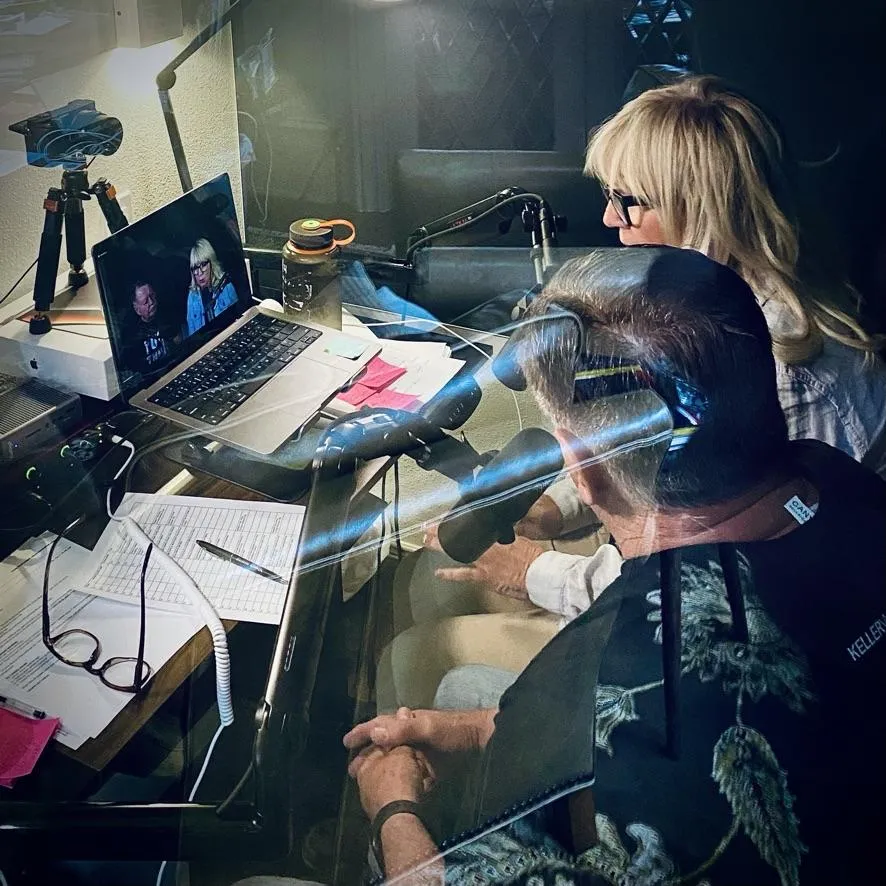
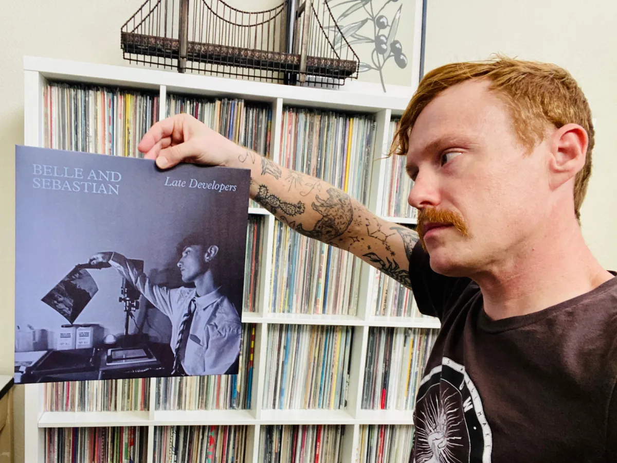
In the fall of 2022, Andy went all in on YouTube, transitioning a decade-and-a-half of written online content into scripting, filming, and producing videos for the platform as the FensePost Vinyl Channel.
He is currently working to get his real estate sales agent license in the state of Texas with plans to be licensed in early 2024.
FENSEPOST VINYL CHANNEL
From deep dives into album history and album artwork to new album reviews, countdowns to vinyl collector tips, Andy has honed his camera-facing persona over the past few years. New videos go live twice a week!
REAL ESTATE RECRUITING
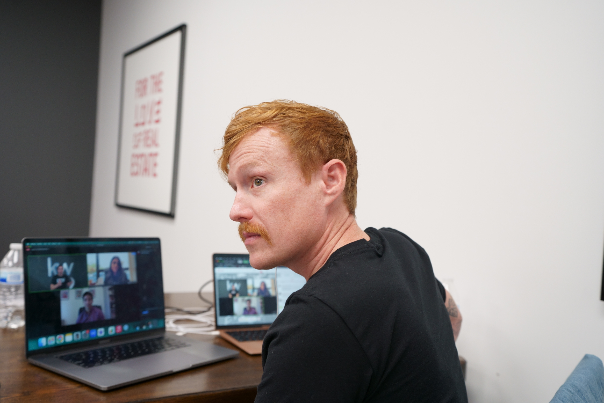
In fall 2021, Andy joined Keller Williams, working with Linda McKissack. He manages a community built around KW Profit Share training and coaching. He also takes advantage of the products offered, running his own recruiting site.
PROFIT SHARE PREMIUM SUPPORT
Parallel to the Profit Share Recruiting Sites, Andy assists Sites users with Premium Support. Through Zoom sessions, he coaches users in the strategy, implementation, customization, and utilization of the Recruiting Platform.
FENSEPOST MUSIC BLOG
Founded in 2006, Andy rarely pens new written articles on the blog. But there is no shortage of content here, having crafted thousands of articles, reviews, and more, spanning over a decade of content creation!
PERSONAL LIFE
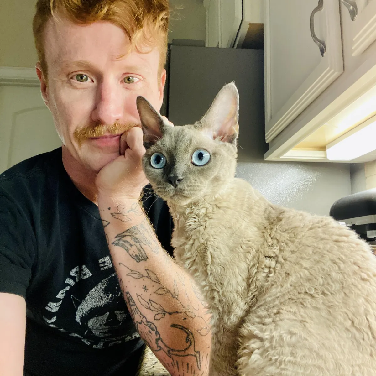
In 2007, Andy married his wife (who is also named Andi*), and they live in the DFW metroplex with Waffles, a quirky little Devon Rex cat.
Andy strives to live a healthy and active lifestyle. His love of cycling sees him logging thousands of miles each year on his 2020 Specialized road bike, hitting the vast paved trails throughout the metroxplex on lengthy bike rides while binging audiobooks on personal growth, musician autobiographies, and entrepreneurship.
*Andi prefers to not have a digital presence, hence no photos here.